![Dr. Plano_Logo_mono.svg]](https://help.dr-plano.com/hubfs/Dr.%20Plano_Logo_mono.svg)
Add our custom code
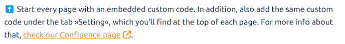
A few of the essential improvements of the knowledge base are implemented by ourselves and not provided by HubSpot: For example, the table of contents on every page, the scroll to the top button, some style improvements, the "copy anchor link" feature, and more. To get all the custom implementations, you must add two code snippets:
- Go to the tab »Settings« of the new article. Then go to
advanced options > Additional code snippets > Head HTML. Copy and paste the following code there:<!-- load drp styles -->
<link rel="stylesheet" href="https://extras.dr-plano.com/wp-content/uploads/knowledge-base/drp-styles.css">
<!-- load self-hosted jQuery -->
<script src="https://extras.dr-plano.com/wp-content/uploads/knowledge-base/jquery.js" crossorigin="anonymous"></script>
<!-- load drp scripts -->
<script type="text/javascript" src="https://extras.dr-plano.com/wp-content/uploads/knowledge-base/drp-scripts.js" crossorigin="anonymous"></script>
<!--load our font awesome kit-->
<script src="https://kit.fontawesome.com/771c509a29.js" crossorigin="anonymous"></script>
<!-- add a element that can be used to set a link that scrolls to the very top of the page -->
<a id="scroll-to-top" data-hs-anchor="true"></a> - Switch back to the tab »Write«. Directly beneath the subtitle, add an »Embed« element:
 Add the following code to the modal that shows up and hit "insert":
<div id="drpCustomTemplate"> </div>
Creating a table of contents
Adding the custom code (s. above) will automatically generate a table of contents and add it to the top of the page. As it's a custom implementation and not provided by HubSpot, you only see the table of contents in the preview or published version of the page. 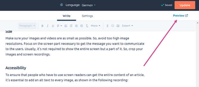
The entries in the table of contents will be automatically linked to the headlines/sections of the page so that one can click them to scroll down to the desired section automatically. If you miss adding anchors to the headlines, your table of contents will contain no links or not for all entries, as shown in the example here:
To find out more about adding anchors, see below.
Bypass caching for the newest version
HubSpot caches the articles on its server. So, you might change an article and update it, but there’s no change in the published version. Don’t get confused. The cache will be updated automatically and at a regular rhythm (set by HubSpot; probably every one or two hours). After that, your changes will be published.
If you wish to see your changes before the cache update, either use the preview version of the article or do the following two steps to bypass the cache and see the newest/uncached version:
- Ensure your browser doesn’t use your local cache by hitting the shortcut
STRG + F5(on Windows). - Ensure the Hubspot server delivers you the newest version by adding the following query parameter to the URL of the page you’re interested in:
?hsDebug=true&hsCacheBuste- The changed URL should look like the following:
https://help.dr-plano.com/de/this-is-a-test?hsDebug=true&hsCacheBuste
- The changed URL should look like the following:
☝️Your changes will be automatically saved. If you don't have the right to publish an article, please use the preview to see the result of your changes.
Headings and font styles
The title of an article is automatically styled as »Heading 1« and the subtitle as »Heading 2« (both should be set for each article). Any further headline in your article should be styled as »Heading 3« or »Heading 4«. Ensure that »Heading 4« is always a subheading of »Heading 3«. In other words, there's a »Heading 3« above.
The regular text should be styled as a »Paragraph«.
If you have a code in your article, you should use the inline code format for short stuff and a »Code block« for extended code snippets, as you can see in the example below:
<longCode>
<script id="drp-script" src="https://www.dr-plano.com/de/static/booking-plugin/code.js" data-backend-url="https://backend.dr-plano.com" data-id="163507870" data-frontend-url="https://www.dr-plano.com/de"></script>
</longCode>
Anchors
Anchors are vital as the automatically created table of contents only works when they exist. In addition, you need anchors to link to a specific section of an article so that the user doesn't need to read through the entire article to find the correct section.
HubSpot's knowledge base does not provide the automatic addition of anchors. Therefore, you have to add them manually:
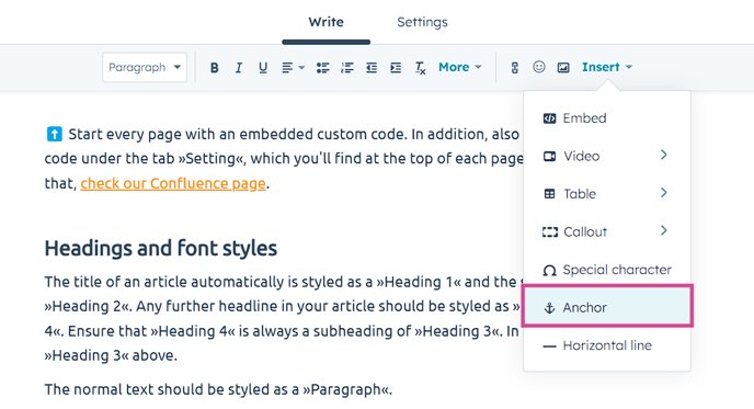
Placing the anchors
You can add anchors wherever you want. However, to stay consistent, you should add an anchor to every heading (headings 3 and 4). More precisely, add an anchor right after each heading. As shown here:
Naming the anchors
You have to give each anchor a name that will be the id of that anchor if you check the code using the developer console. Follow the rules below when naming:
- English: No matter in which language you write the article, the anchor name should be in English. It will appear in the URL when the anchor link is used, where everything should be in English.
- Copy the existing anchor names when you translate an existing article to another language. They should be identical for the headings in all languages we have.
- Heading as orientation: The name should be very close to the headline, as it will appear in the link you send to a user. It's better UX to have a meaningful link that gives the user a hint about the linked page's content. So, if the headline is »Headings and font styles«, you would enter »headings-and-font-styles« as the anchor's name.
- The name should always be in kebab case (spaces are replaced with hyphens, and the words are all lowercase).
- The name must be unique in the entire article.
Please be aware that you should avoid changing the anchor names, as this will cause all links to that anchor to break.
Links
For better UX, you must add links to your article wherever you want to reference another article or a page in Dr. Plano. To add a link, hit the link button in the top menu, which opens a modal with different options:
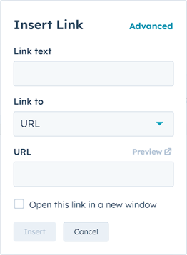
Link to a page in the Dr. Plano app
Link text: Always add a link text instead of only pasting the page URL you want to link to. The part of the text you add the link to should be meaningful. Here you see a good and a bad example:
This is an example to show what a good link looks like.
This is an example to show a bad link: https://app-eu1.hubspot.com/knowledge/26626463
URL target: Try to be as specific as possible with your URL. For example, if you can link to a section of a page instead of the entire page, please do that. That makes it easier for the user to find the correct place/answer.
URL and localization: Our URLs usually start with www.dr-plano.com where .com is our default top-level domain [TLD]. We also have country-specific TLDs like .de and .at, which will always forward the website visitor to www.dr-plano.com followed by /<country-code> so that the entire URL looks, for instance, like www.dr-plano.com/de. Consider the following rules for your links:
- Public & English: When you link to our public page and you want to have the English version, link to
www.dr-plano.com. - Public & German: For the German language, you can take any of the countries with German language, but as we have a lot of German customers, it's reasonable to go with
www.dr-plano.com/deby default. - Public & specific country: This should be an edge case, but if you want to target a particular country, you can link to that country's version by correctly setting the country code that follows after the TLD.
- Links to the client area (pages for registered users): Technically, you can't influence which language will be shown after the login, as our app knows the user's country and will switch to the correct country no matter which country code you had included in the URL. You could also leave out the country code entirely; after the login, it will be added automatically. So, you could have a link like the following:
www.dr-plano.com/client/time-stampwhich will change to the following if a Dutch user logs in:www.dr-plano.com/nl/client/time-stamp. ☝️That being said, it's not irrelevant if and which country code you include in your link, as the language of the public page, including the login area, will change accordingly (as explained above). For better UX, a link in an English knowledge base article should bring the reader to an English page (generally speaking). Therefore, use the same rules as above to decide if you go withwww.dr-plano.com/client/…orwww.dr-plano.com/de/client/…or another country-specific URL.
New window: If the link is not pointing to a section/headline of the same article, check the checkbox »Open this link in a new window«: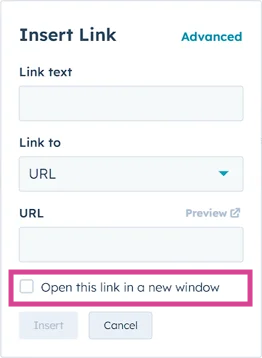
💡If you add a link that opens in a new window, an icon will automatically be added to the end of your link, indicating that the link will open in a new window. You'll only see that icon on the published version and not in the edit view. E.g., the section above with the link will look like the following in the published version:
As you can see in the screenshot, the full stop directly after the icon looks ugly. Therefore, the following rule should be followed for punctuation marks after an icon:
✅ Leave out punctuation marks after icons if they stay at the very end of a paragraph.
❌ Set the punctuation marks after icons if other words, sentences, etc., follow.
Link to another knowledge base article
All the guidelines for a link to a page in Dr. Plano also apply to this type of link. However, you don't need to add the URL here; you can search for the page you want to link to.
Please choose the correct language version of the article you want to link to.
Links to other knowledge base articles should always open in a new window.
Link to an anchor
If you're able to link to a specific article section, please do that instead of linking to the entire article. That makes it easier for the user to find the correct place/answer. To do so, you must link to an anchor (read more about anchors above). There are two ways to do so:
- If you want to link to an anchor on the same page:
- If you wish to link to an anchor on another page:
So, if you want to link to an anchor on another knowledge base article, you must choose the option »URL« in the link's modal and not the option »one of your pages«.
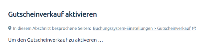
Provide discussed Dr. Plano pages for each section
At the beginning of each article section (right after your headline), you should provide the Dr. Plano pages you will discuss in the following section. There are at least two good reasons why you should give that info:
- While reading your instructions, the user wants to implement each step of the instructions in the app immediately. Therefore, the user should be able to open the related page easily.
- The user wants to visualize the interface to understand and remember your instructions better. Therefore, it's helpful to point out at the beginning which page is referred to in the section.
For an even better user experience, the styling of this "discussed pages" info line should always be the same so that the user quickly finds the pages they want to open. But no worries, you don't need to handle all the styling alone. There will be some »magic« 🪄, giving your text the correct styles.
The final version of the "discussed pages" info line will look the following:
The version you need to add to your article is much simpler:
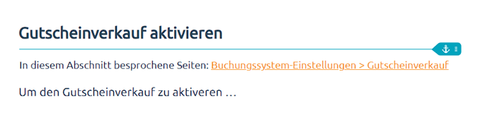
As you can see, icons will be added to the final version, and the font color and size will change.
👀 Remember that you'll see the final version only when the article is published and in preview mode, not while writing it.
☝️ To ensure that the styling is added to your text, your text must match perfectly the following:
- German article:
In diesem Abschnitt besprochene Seiten: <add your link and set »Open this link in a new window«> - English article:
Discussed pages in this section: <add your link and set »Open this link in a new window«>
Providing multiple pages
Sometimes, you talk about multiple pages in the same section. So, you should provide the link to all pages. Here is an example of the final version: 
Your version of that line in the article looks like the following:

The start is the same as providing a single page. You add another link at the end and separate it from the first link by a whitespace (no comma, etc. needed):
- German article:
In diesem Abschnitt besprochene Seiten: <link 1> <link 2> - English article:
Discussed pages in this section: <link 1> <link 2>
Including navigation steps into your link
In the examples provided previously, the link to the page was sometimes simple, like Kalender, and sometimes composed of two parts, like Buchungssystem-Einstellungen > Gutscheinverkauf. The last one starts with a navigation step followed by a chevron > and then ends with the discussed page. That extra step explains to the user how to access the page »Gutscheinverkauf« and helps the user learn the structure of Dr. Plano.
However, you should follow two rules to ensure the links don't get too long:
- Do not include navigation steps for the main pages, e.g., time clock, sales, and report.
- Only include a maximum of one navigation step into your link.
- ✅ Buchungssystem-Einstellungen > Gutscheinverkauf
- ❌ Kalender > Buchungssystem-Einstellungen > Gutscheinverkauf
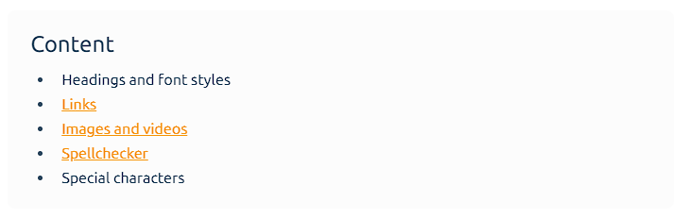
Images and videos
The most important rule about images: Use as few images as possible. They are challenging to keep up to date and are more time-consuming to produce than describing the content. There are only a few good cases where you can use an image/screenshot:
- When you can't insert a link to the main section of the app you're talking about in your article, you should add a screenshot to facilitate the orientation of the readers. But remember: This only applies to the main topic you are discussing.
❌ Do not add screenshots for relatively unimportant parts of the topic you're discussing. - When you want to describe several steps a user has to take to achieve something, and those steps do not correspond to the order of the UI elements. For example, the first step is at the top of the screen, the second is at the bottom, the third is in the middle, etc.
❌ So, don't add a screenshot where you put three or four steps on it that go from top to bottom and follow exactly the order of the UI elements. - A long article without a single picture might put some readers off. So, if your article has at least thirty lines without any screenshots, you can add an image of the main discussed section or the main outcome of the steps you're describing to make it more appealing for the readers to read the article.
❌ But don't add a screenshot if there's no good content for it. Remember: No image is better than a meaningless or repetitive image.
Size
To have consistent looking and good readable screenshots, follow these rules:
- Choose the correct monitor: Always take screenshots on a full HD monitor with a resolution of 1920 x 1080px. Screenshots taken on, e.g., a 4k monitor will be bigger, which we don't want to have.
- Screenshot the mobile version: To ensure mobile users can also use the knowledge base, screenshots should be taken of the mobile version. To do so, you can use Google Chrome's device simulation feature. Follow the instructions given in this video:
- Crop your images: To focus on the screen part necessary to convey the message you want to communicate to the users. Usually, it's not required to show the entire height of the screen. 💡Recommendation for your workflow:
- Follow the steps above to get to the mobile version of the page you want to screenshot.
- Don't care now about cropping. Take a screenshot of the entire screen and paste it to Figma.
- In Figma, crop the height (leave the width as it is for a consistent look) of the image to get rid of sections/info you don't want the user to be distracted by. See the Figma instructions below ⬇️
If you copy & paste a screenshot into an article by hitting STRG + V, the preview of that image in the edit mode of the article might look distorted, like in the following example:  No worries! It will most likely get fixed in the published version. To check it before publishing, you should have a look at the preview:
Add annotations to your image using »Figma«
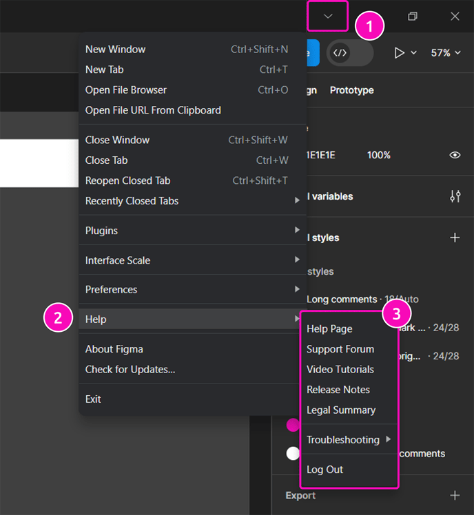
For adding annotations, we use the popular software Figma
You can use Figma via your browser or by installing the desktop app (recommended). But first things first, you need to create a free account if you don't have one yet. Then Ask Mui to invite you to our knowledge base team, where you will get access to our project »Knowledge base«. There, you'll find a file named »Instructions + workspace for your images« (or click simply here). In that file, you will find everything you need to add annotations to your screenshot (including detailed instructions).
If you're not familiar with using Figma, here are some good starting points:
- Watch the following tutorial on YouTube, which gives you a good overview of the interface and basic features of Figma. You can stop watching after the section »Components« (around 33 Minutes). Then you'll have learned more than you'll need to add annotations for the knowledge base, but it's always good to know some basics of Figma.
- For more help, check out Figma's help options. On the desktop version, you'll find help here:
Accessibility
To ensure that people who have to use screen readers can get the entire content of an article, it's essential to add an alt text to every image, as shown in the following recording:
☝️ Ensure that the alt texts are in the same language as the article.
HubSpot and external videos
If you've got a screen recording you want to add to your article, don't just paste the link to it (e.g., to »Awesome Screen Recorder« if you used that app to record your screen), but upload it to HubSpot. That way, the user gets a more seamless experience.
Only long videos like our tutorial videos on YouTube should be inserted as an external video, as shown in the following recording:
Spellchecker
Ensure you always use a spell checker to avoid typos:
- Turn on the spell checking on your browser and add German and English dictionaries.
- In addition, for German articles, use the browser add-on LanguageTool
- In addition, for English articles, use the browser add-on Grammarly
- Use ChatGPT and ask our GPT for KB to improve and shorten your text before you submit it to the reviewer.
- If you have two words and need to decide which is more appropriate, ask our GPT for KB
Special characters
For consistency, follow the rules about some special characters we use.
Dashes and hyphen
Generally, there are three types of horizontal lines:
-
-called “hyphen” or in German “Bindestrich, Trennstrich”-
Our use cases: A hyphen is a punctuation mark to join words or parts of words. It’s not interchangeable with other types of dashes. Correct example:
We’re looking for a dog-friendly hotel. -
Use the hyphen on your keyboard to add a hyphen to your text.
-
-
–called “en dash” or in German “Gedankenstrich, Parenthesestrich, Halbgeviertstrich”-
Our use cases: A “en dash” separates groups of words, not parts of words as a hyphen does. Correct example:
Dr. Plano – App for scheduling and booking. -
To add an “en dash” to your text, you’ve to press the following keys on your keyboard:
Windows*:
Alt+0150OSX:
⌘ -
-
-
—Called “em dash” or, in German, “Geviertstrich”-
Our use cases: A “em dash” is the longest horizontal line. In traditional English typesetting, the em dash is also used as an en dash, but without enclosing spaces to keep the resulting gap in the text small (e.g., "the fire drill—it was chaos"). However, this tradition is not undisputed in modern English typesetting; instead, the en dash with enclosing spaces is also used today, as it is used, for example, in German typesetting. We usually do not use the em dash.
-
To add an “em dash” to your text, you’ve to press the following keys on your keyboard:
Windows*:
Alt+0151OSX:
⌘ ⇧ -
-
Chevrons: »«
We do use them for all quotations. Example:
You find all open request in the »swap shop«
To add chevrons, hit the following on your keyboard:
» Alt+175
« Alt+174
OSX:
» ⌥ ⇧ q
« ⌥ q
Ellipsis (German: Auslassungspunkte) …
Those three little dots are called ellipses (plural: ellipses). The term ellipsis comes from the Greek word “omission,” and that’s what an ellipsis does – it shows that something has been left out.
⚠️ We never use three dots in a row!
Correct:
Show details…
Wrong:
Show details...
To add chevrons, hit the following on your keyboard:
Windows*: Alt+0133
OSX: ⌥ .
Callouts
If you wish to emphasize a paragraph, use a so-called »callout«:
 To stay consistent, limit yourself to only »Tip« and »Caution«.
For tips and everything positive, use the callout version »Tip«.
For warnings and everything negative, use the callout version »Caution«.
☝️ Do not use two callouts in close succession. That would be visually too overwhelming and the two elements would fight against each other for getting the reader's attention. Either restructure your text to avoid the close succession or use one of the suggested emojis in the next section to get more but not too much visual attention.
Emojis instead of callouts
If you want to emphasize a sentence or paragraph but a callout highlights too much, use one of the following emojis.
- 💡 – for a very handy tip.
- ☝️ – for critical hints that are like warnings as the consequences are serious if the reader doesn't follow your instruction.
- ⚠️ – this is similar to ☝️but stresses more the warning.
- ⬆️⬇️ – if you link to an anchor on the same page and want to indicate to the user that clicking on the link won't bring them to another page, you can append one of the arrows to your hyperlink like in this example: See the section for emojis above ⬆️
❌ Don't use these emojis if you already use a callout.
Mark the article or sections as a draft/with a to-do
Suppose you cannot finish an entire article or particular areas immediately but must postpone it. You should mark that in the article to communicate it to your colleagues and also as a reminder for yourself.
Warning callout + to-do
To have proper, consistent communication, you must go through two steps:- In the section above about callouts, we saw that you should limit the types of callouts you use in your article. For the purpose here, you should use the callout type »Warning« to mark something as a draft. This callout type won't be used for other purposes.
- For the callout text, you must provide the Jira ticket created for the remaining task. That ensures the to-do isn't forgotten and the task is described clearly in the ticket. So, please write the following into the callout: TODO: PLANO-<ticket number>. Additionally, you can also add a comment to the callout.
☝️ It is crucial that you adhere to this spelling and structure strictly. This makes it easier to search for articles with to-do callouts.
In the end, your to-do callout should look like the following: 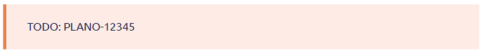
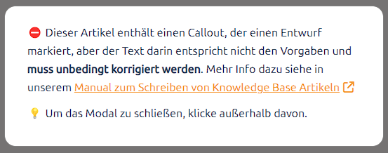
Modal that reminds of to-do callouts in the article
To make it easier for everyone visiting a knowledge base article that the page is not finished yet, there'll be a check in the background on every page load (means preview and not updating), and if matching, a modal will show up that gives a hint about to-do callouts on the page. It looks like the following:  If there's a to-do callout on the loaded article page that doesn't fulfill the requirements (the two steps above), an error modal will show up instead:
Wrap names of pages, sections, and elements in chevrons
To help your readers recognize Dr. Plano's pages, sections, and elements you've mentioned in your article, you should wrap the names in chevrons. For example:
If you want to activate the online payment with Dr. Plano, please open the top right menu and click »Booking system settings«, then »Online payment«. Please follow the instructions there.
By marking the names that way, you indicate that the user can look for the exact same name to navigate in Dr. Plano. So, they serve as landmarks.
You can leave out the chevrons in cases where you've already emphasized something visually, e.g., by adding a hyperlink to it. For example:
In the »Booking system settings«, you'll find the section Data protection
However, consider adding the chevrons also to hyperlinks when the link text contains a name and some other text. For example:
In the »Booking system settings«, click on »Data protection« to open the privacy settings.
Step-by-Step instruction formatting
If you want the user to take more than two steps to achieve something, please use a sorted list like the following and go through the steps one by one:
- Step one …
- Step two …
- Step three …
- etc.
Use bold to emphasize instead of italics
If you want to emphasize a (group of) words, please make them bold. Be moderate with the use of bolded words because multiple in the same paragraph will fight for the reader's attention instead of leading the attention through the text.
❌ Don't use italics for emphasizing. We only use italics for long quotes without quotation marks.